Graham’s Updated Website Improves User Experience
August 11, 2016

At Graham Architectural Products, we have enhanced our website to more clearly communicate company areas of expertise and provide faster access to the information visitors seek.
Details on some of the more notable upgrades follow.
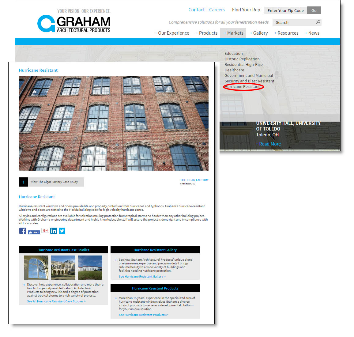
Home page navigation has been modified. We’ve added a Markets tab to better feature content based on Graham’s specific areas of window expertise: Education, Historic Replication, Residential High-Rise, Healthcare, Government and Municipal, Security and Blast Resistant, and Hurricane Resistant.
Under each of those specific sections, visitors can now find content relevant to Graham’s experience, including case studies, product listings, and project galleries.
We’ve also added a Gallery heading to more effectively showcase project photography.
Meanwhile, we’ve made our product locator tool much friendlier, with the result being more streamlined, less cumbersome, search results. Visitors have two alternatives under the Products tab. They can either click on the specific product options they’re looking for to dynamically generate a relevant product list, or they can choose to view a comprehensive list of products offered under each of three categories: Commercial Products, Blast Products, or Hurricane Impact Products.
Either way, access to detailed product specifications is only a click or two away.
We’ve made other changes, too, such as providing links to social medial platforms to create a greater sense of community among our customers, vendors and friends. And in the Product Literature section under the Resources tab, a simple rollover allows you to view an image of the brochure or document prior to downloading.
The bottom line? Graham’s updated website does a better job of communicating who we are, while also doing a better job of delivering what you need.
